CHALLENGE
IMPACT
ABC Chemicals had built a name over 30 years—steady, reliable, warm. But that name came with an outdated look. The identity was stuck in the past, even as the company looked outward to international markets.
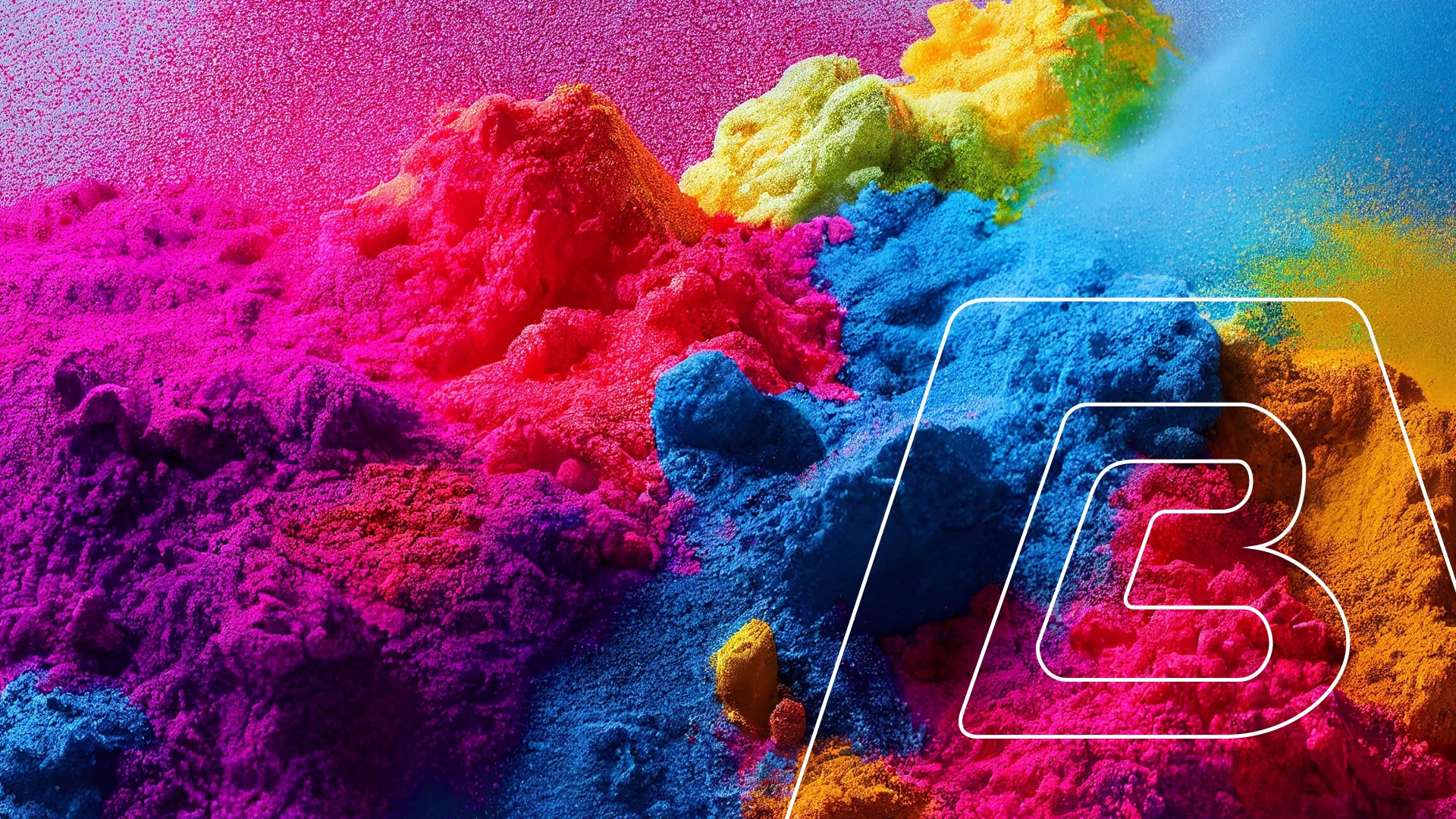
The logo had emotional weight but lacked structure. The colours felt too serious. The form? Off balance.
That’s where 9Point Design stepped in.
We redesigned the logo with care, keeping the essence but correcting the form. Introduced softer curves to signal their people-first approach. Refreshed the colour palette for a modern, energetic feel. And added a wordmark that gave clarity in new markets.
This wasn’t a cosmetic fix. It was strategic scaffolding for a brand ready to scale.
Because when trust is your business, your identity better walk the talk.
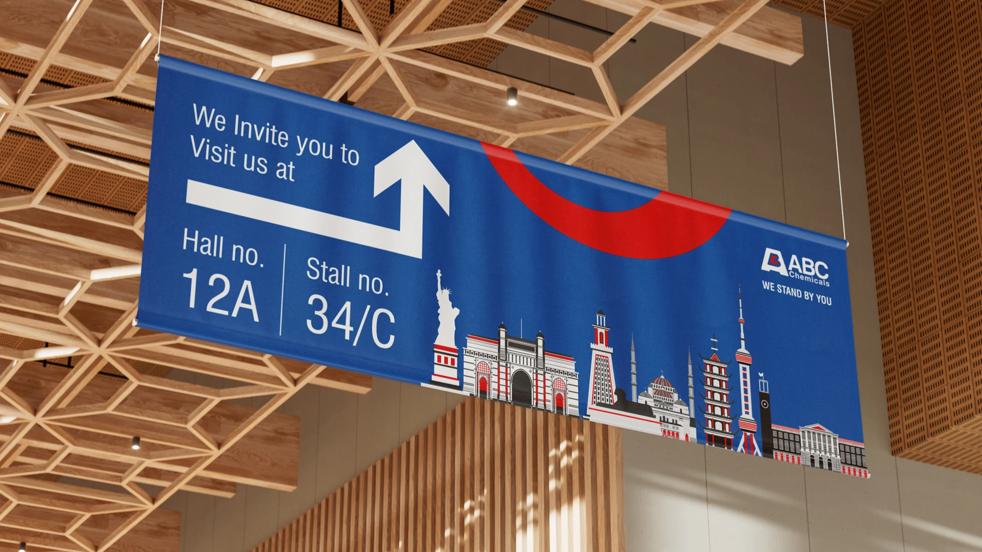
Scope: Brand Strategy, Brand Identity, Logo Redesign, Brand Communication, Visual Language, Stationery, Brand Guidelines, Event Support
Client: ABC Chemicals
Industry: Chemical Trading
Legacy respected, form refined
Strategic rebrand for a business that leads with heart.
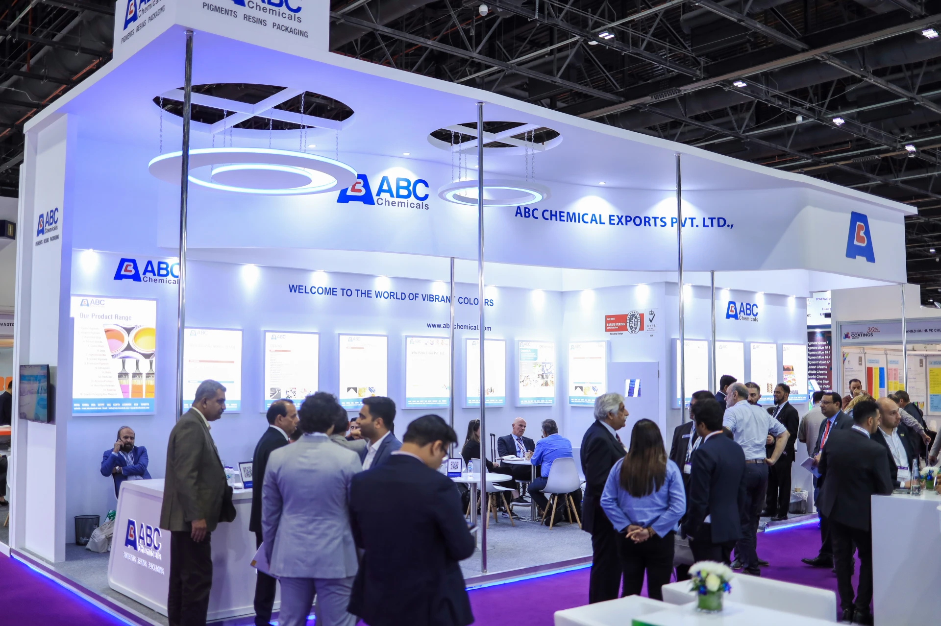
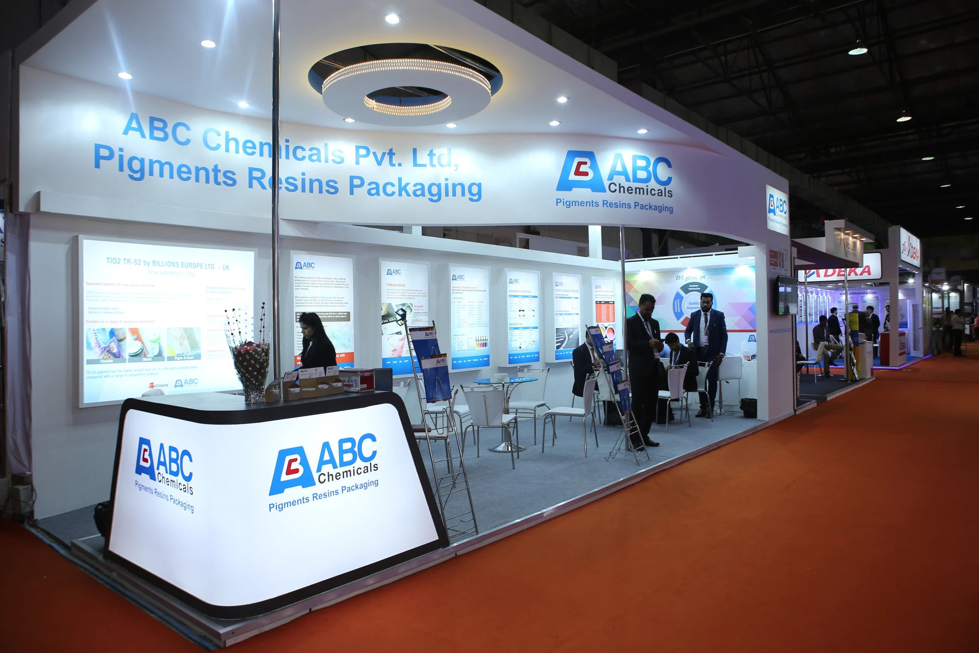
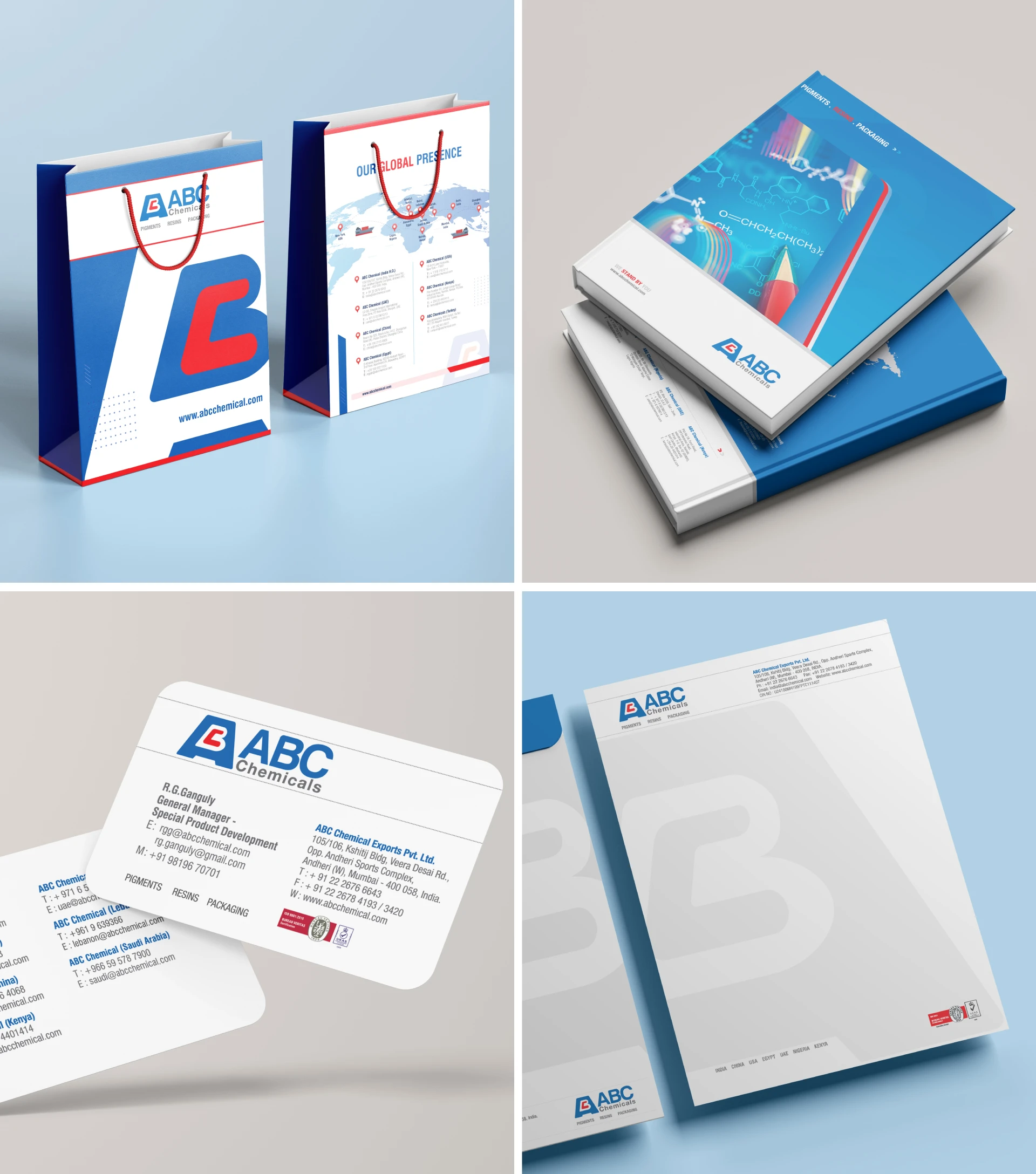
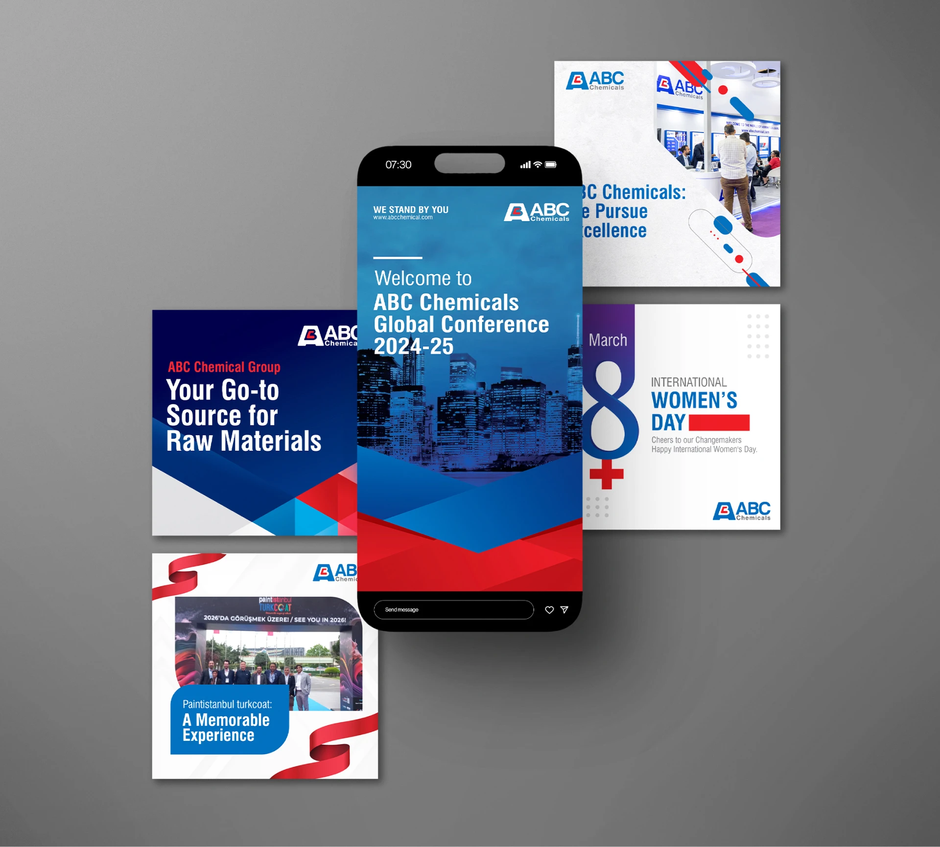
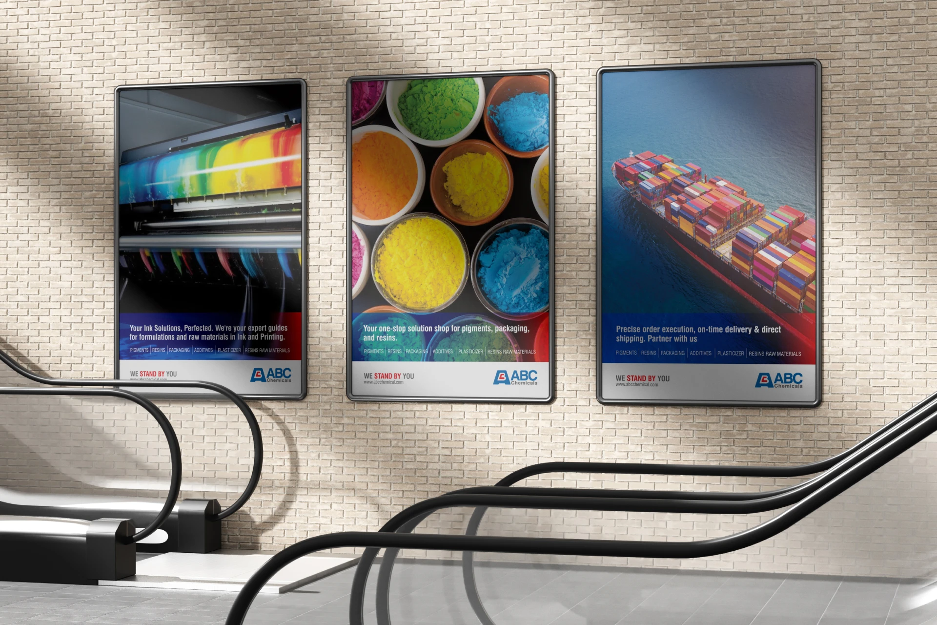
A Branding System, not pieces
One visual language across cards, kits, and carry.
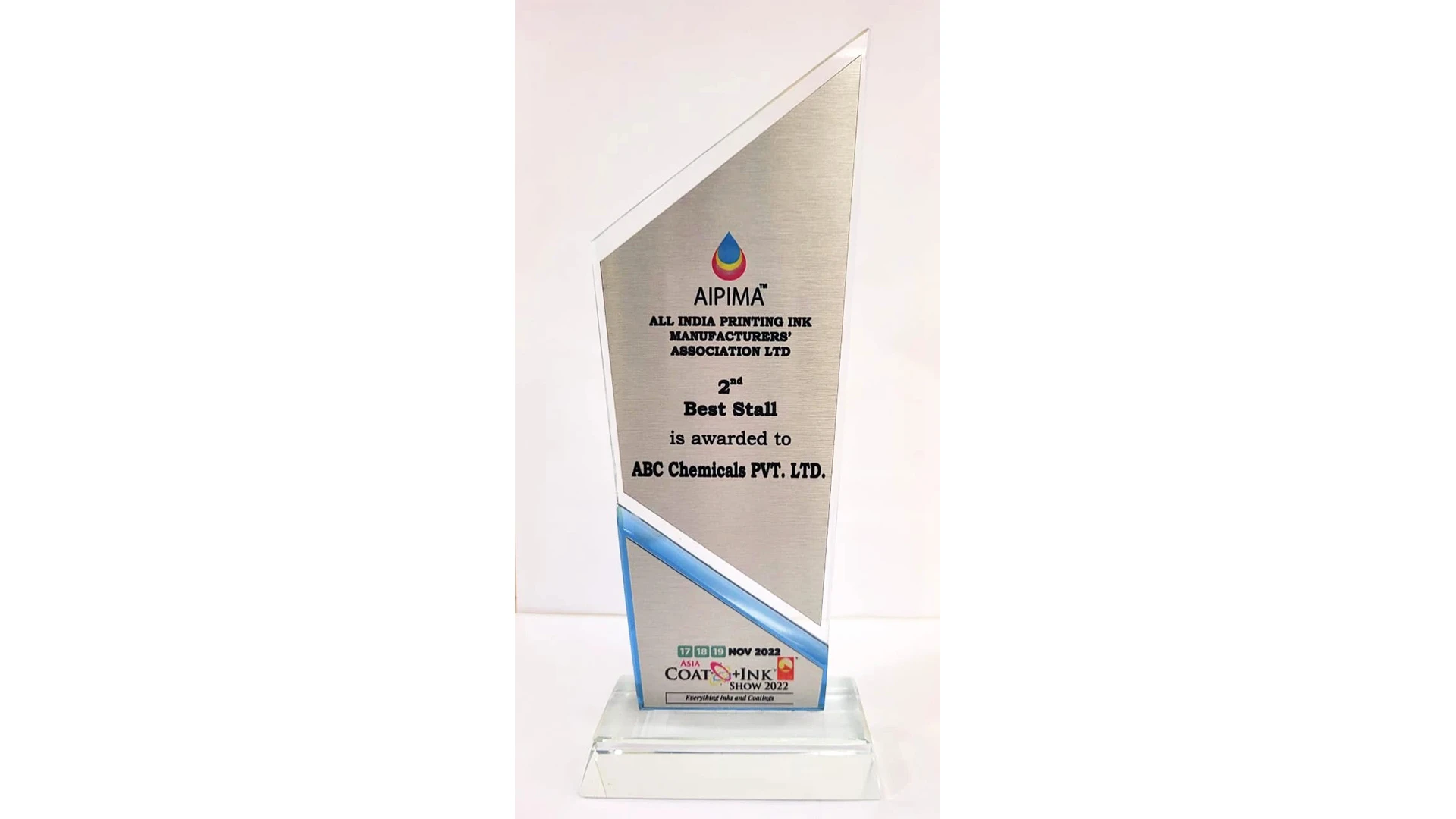
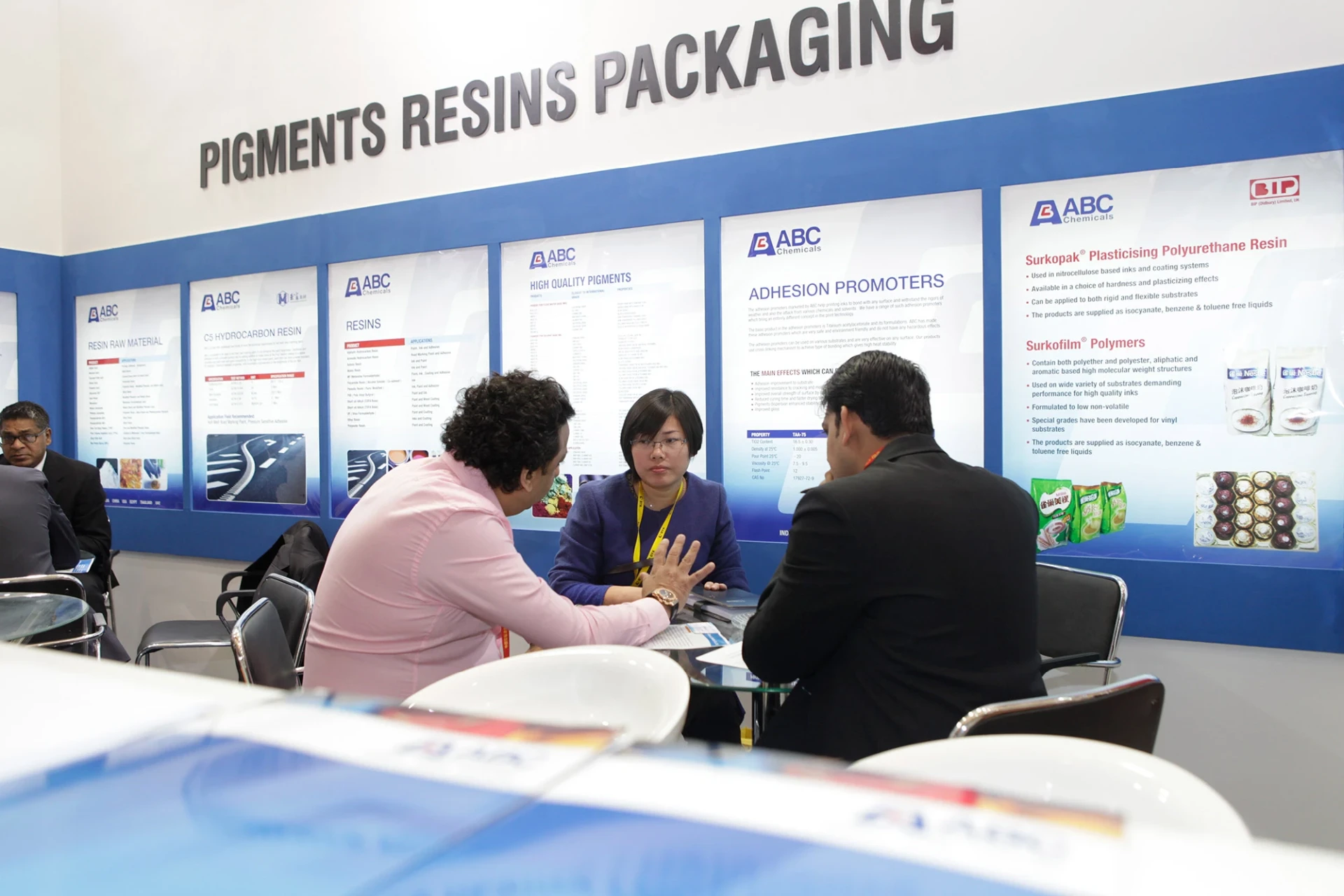
Own the aisle
High-contrast messaging that stops feet and starts chats.
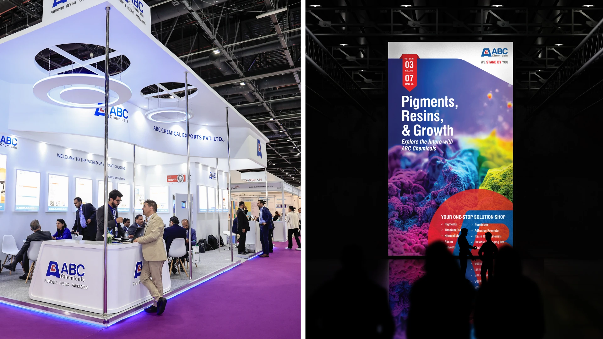
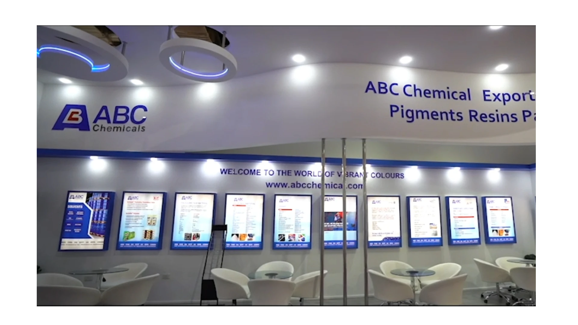
From crowds to conversations