CHALLENGE
IMPACT
Seva Sadan Society: Design with heart
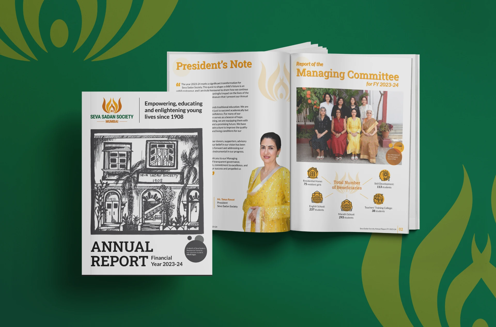
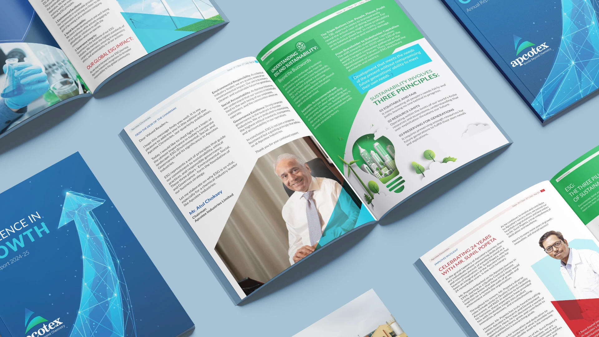
Seva Sadan approached us with a simple request: an annual report designed to give donors, trustees, and supporters a clear view of the year’s impact. What arrived was a Word document that any printer could format. What it lacked was heart, narrative, and the emotional truth of the organisation. We saw an opportunity to bring their mission to life through thoughtful strategy and design.
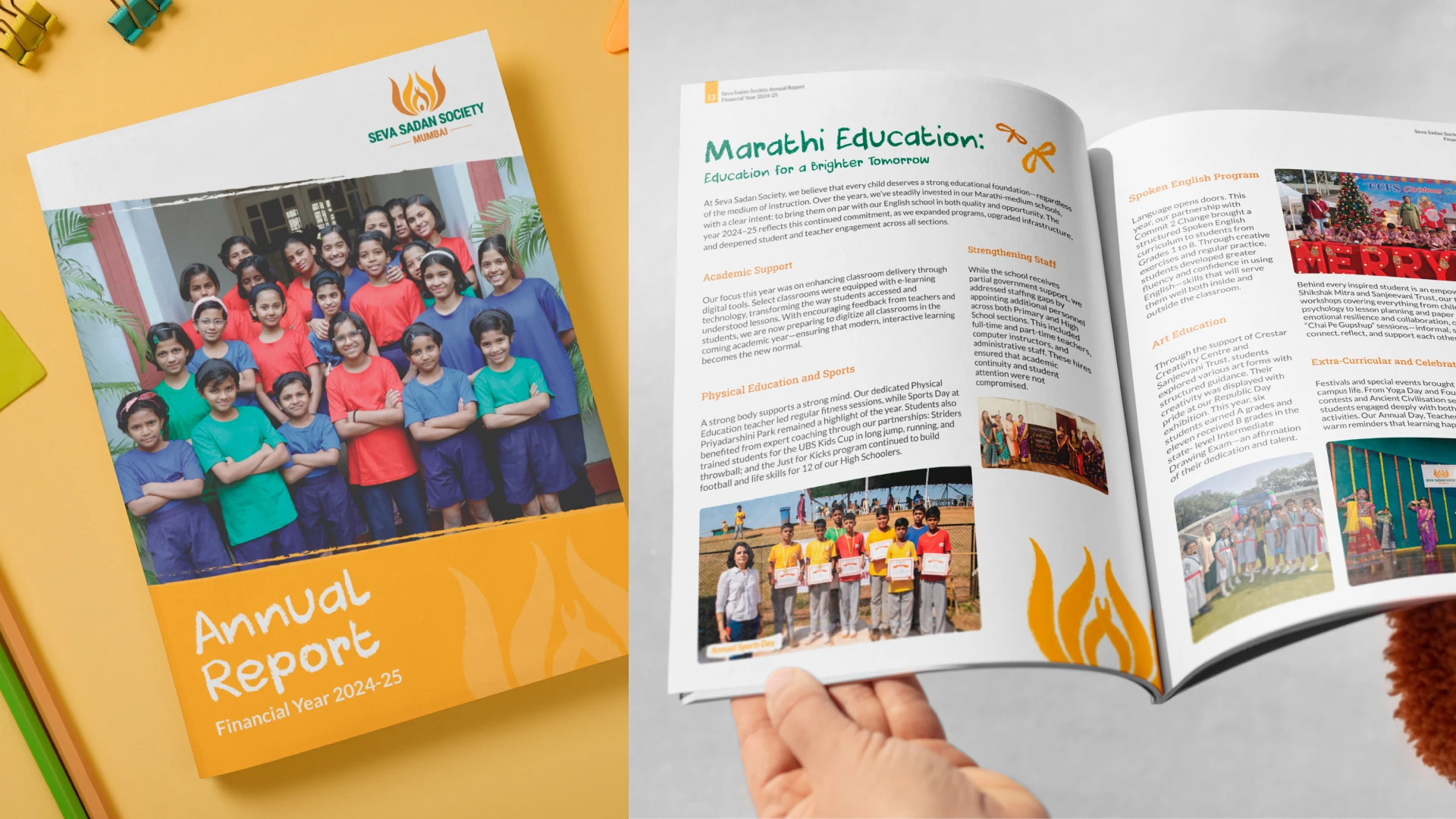
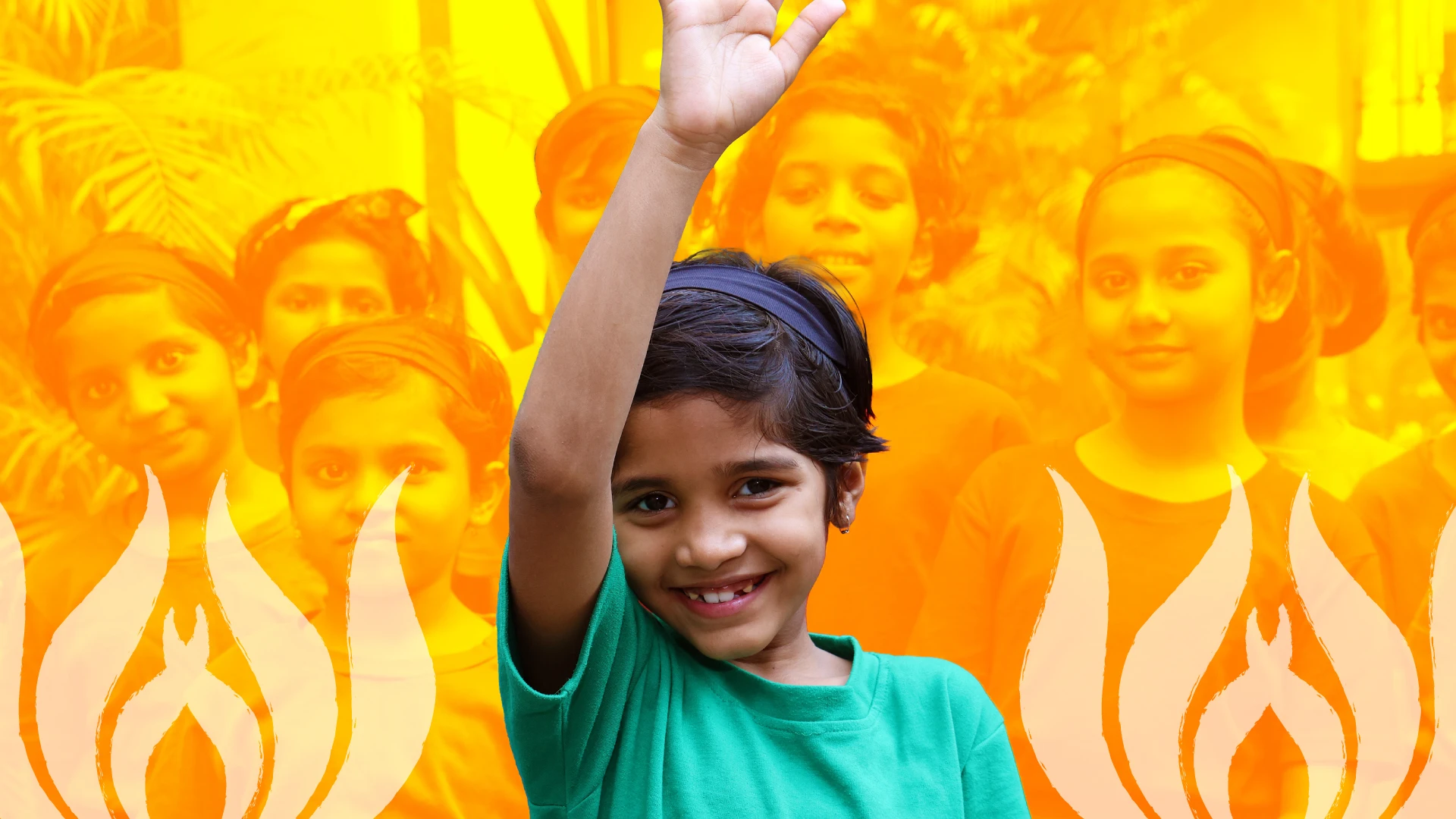
With limited brand assets and only a handful of photographs, we looked deeper. The children, their artwork, their energy, and the symbolism of the lotus and flame in the logo became the real foundation of the brand system. Instead of designing around limitations, we expanded the identity. New colour extensions added warmth and vibrancy. Illustrations and patterns inspired by the logo created recognisable visual motifs. Children’s drawings became authentic storytelling devices, not decorative elements.
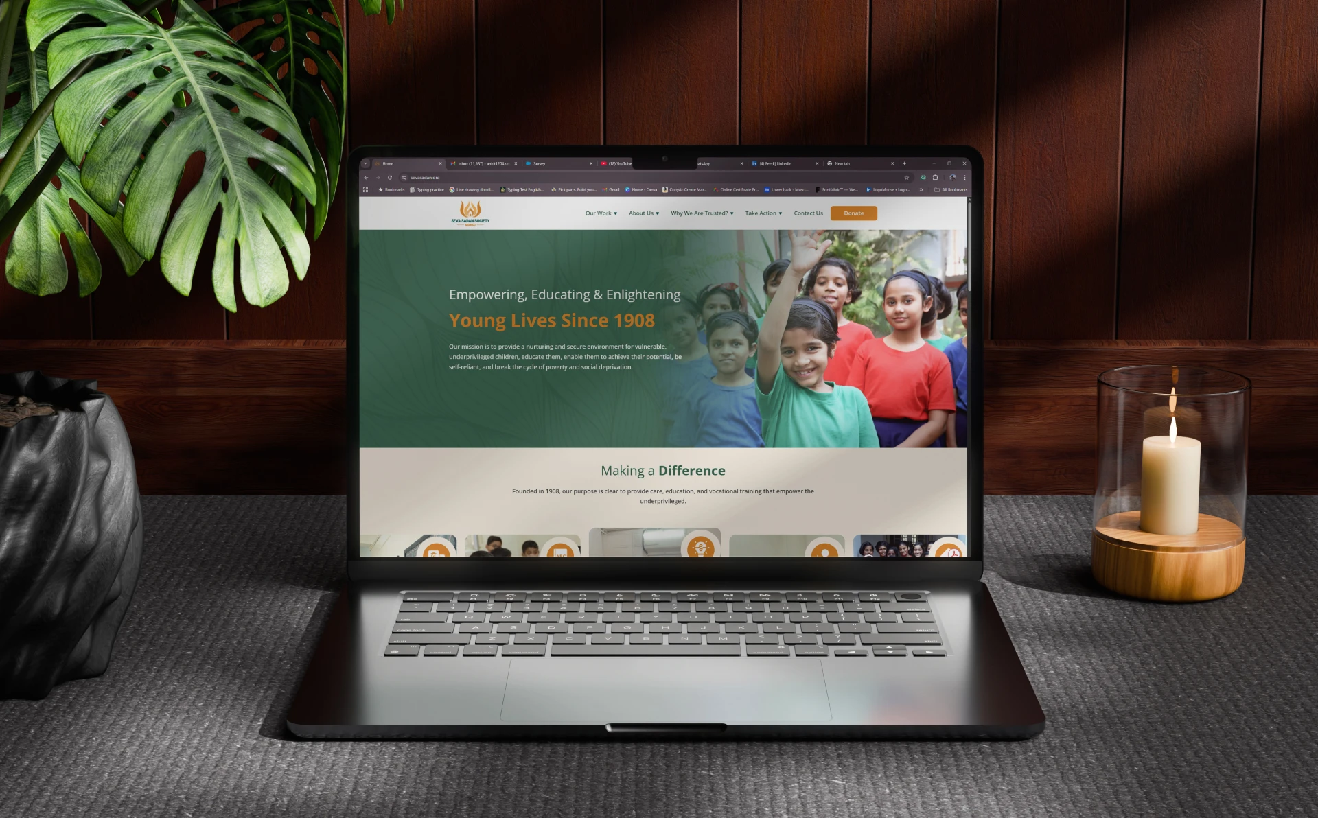
The annual report transformed from a document into a narrative experience. The website followed the same principles and helped the organisation communicate with clarity and dignity.
Design can only amplify truth. Here, the truth was joy and resilience, so we let that lead.
Scope: Annual Report Design, Brand Visual Extensions, Illustration System, Iconography, Website Design, Layout Design, Colour System Expansion, Communication Templates
Client: Seva Sadan Society
Industry: Education, Social Impact, Community Development
Where children’s drawings shaped the design language
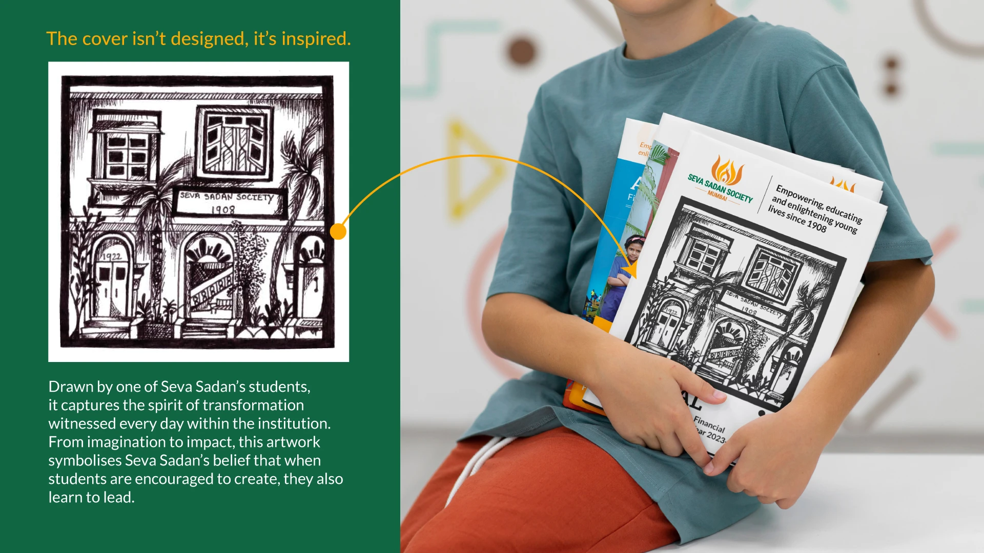
Turning limited assets into a rich visual world
Patterns, icons, and colours inspired by their lotus and flame emblem.